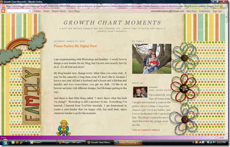
This is what I’ve been spending all my time doing. I’m close to figuring out a header! But I may be so far away and just not realize it yet. I’ve thought I had ‘the one’ about 4 times now. I just keep changing things! How do designers do it???
I need your help. If I knew how to create a poll (read: if I had the TIME to find out how to make a poll), I’d do a cute ‘click on the one you like’ poll. But, since I don’t know how to do a poll, I’ll just number them and ask you what number you like the best.
This is the chance for you to come out of hiding and give me your opinion! I’d LOVE to hear what you think. If you think they all stink, and I should go a completely different direction, tell me! If you like one of them but think I should change a color, placement, or font, tell me! I’m completely open to your thoughts. I’m guessing most of you are more creative than me. I value your input!
Ok, here are the options I’ve come up with so far….
1. Red title, green description, all striped background, red bo5der
2. Brown title, brown description, all striped background, green border
3. Red title, green description, stripes and dots background, red border (this one needs something in that empty space, and I’m not sure what-suggestions?)
4. Crayon background (before I knew how to make borders)
5. No change what-so-ever. It’s the standard, no header, simple template. This is what it’s been up to this point. (I did take away the standard borders because of all the headers I’m trying out)
I know they’re kind of hard to see, but I’m hoping you can get a good idea of what it looks like by these screen shots. Thank you for giving me your opinions! I really feel stuck.


I like 3 and I think for the blank space you can put some of the best pics of Jack in chronological order ... wee babe, older baby, toddler. Maybe him with Buddy Bear?
ReplyDeleteI like #1. It fits very well with the background and doesn't look too busy. Another possible suggestion and it may not be that easy (unfortunately) would be to try to create a header that matches the "FAMILY" font with the brown paper background that appears on the left hand side of your template...
ReplyDeleteI like the contrast of using a darker font in #2. Could you try pairing it with the dots from #3?
ReplyDeleteMom likes #1.
ReplyDeleteI like #1. I think the red title stands out and I think the polka dots are a little too busy. (Good learning via You Tube!)
ReplyDeleteI like the top 2. Good work! We don't have photoshop so I used photobucket and ended up really liking it (well, for web based things- getting prints is a pain)
ReplyDeletetesting and cluttering up your comments!!
ReplyDelete